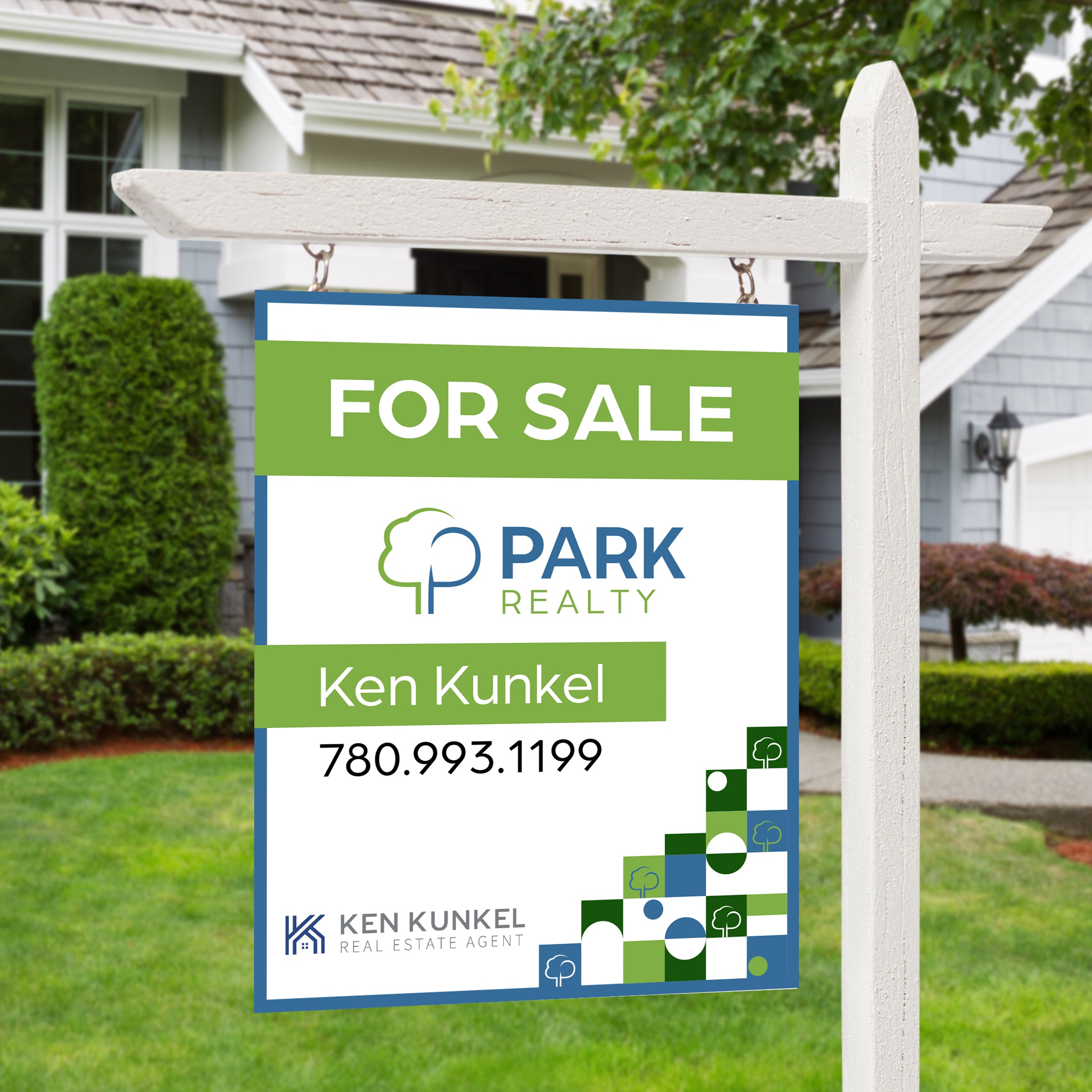
kellsie bennett
2026
About
Park Realty is a real estate brokerage based out of Sherwood Park, designed to reflect trust, growth, and strong community roots. They are known for its client-focused approach and strong presence in the Edmonton market. The goal of this project was to create a refined, modern brand that reflects their professionalism, trust, and high-performing reputation. Through thoughtful design choices and a cohesive visual system, the branding was developed to feel elevated yet approachable — appealing to a wide range of clients while standing out in a competitive real estate landscape.
What’s Included?
The tree-inspired logo symbolizes stability and long-term relationships, while the fresh blue and green color palette balances professionalism with approachability. The brand was developed to translate seamlessly across signage, print materials, and digital platforms, ensuring a cohesive and recognizable presence in a competitive local market.
kellsie bennett
2026
park realty
Developed while working as an in- house designer at Fox & Forth.
Role: Lead Designer – Brand identity, print collateral, and digital assets.
park realty
Developed while working as an in- house designer at Fox & Forth.
Role: Lead Designer – Brand identity, print collateral, and digital assets.
About
Park Realty is a real estate brokerage based out of Sherwood Park, designed to reflect trust, growth, and strong community roots. They are known for its client-focused approach and strong presence in the Edmonton market. The goal of this project was to create a refined, modern brand that reflects their professionalism, trust, and high-performing reputation. Through thoughtful design choices and a cohesive visual system, the branding was developed to feel elevated yet approachable — appealing to a wide range of clients while standing out in a competitive real estate landscape.
What’s Included?
The tree-inspired logo symbolizes stability and long-term relationships, while the fresh blue and green color palette balances professionalism with approachability. The brand was developed to translate seamlessly across signage, print materials, and digital platforms, ensuring a cohesive and recognizable presence in a competitive local market.


