kellsie bennett
2026
kin movement
Self-Initiated Project | Full Brand Identity
About
About
KIN Movement is a wellness brand focused on helping women reconnect with their bodies through intentional movement.
The identity balances strength and softness to create a grounded, modern feel.
Challenge: The goal was to create a brand that stood out in a saturated wellness space—without feeling overly intense or overly feminine.
KIN Movement is a wellness brand focused on helping women reconnect with their bodies through intentional movement.
The identity balances strength and softness to create a grounded, modern feel.
Challenge: The goal was to create a brand that stood out in a saturated wellness space—without feeling overly intense or overly feminine.


The Wordmark
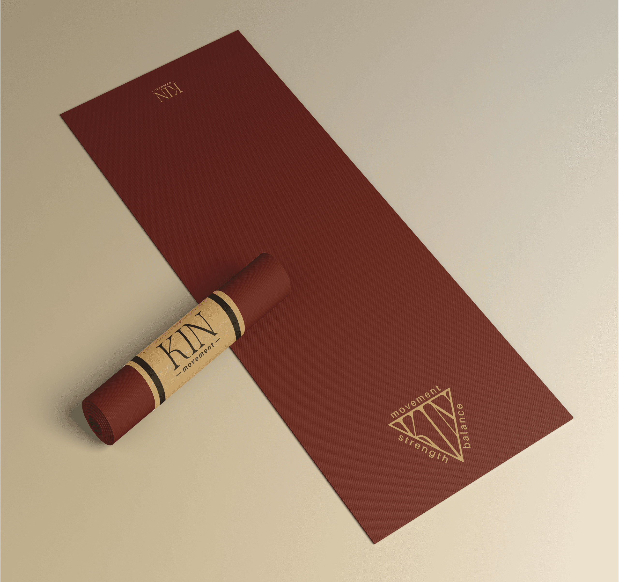
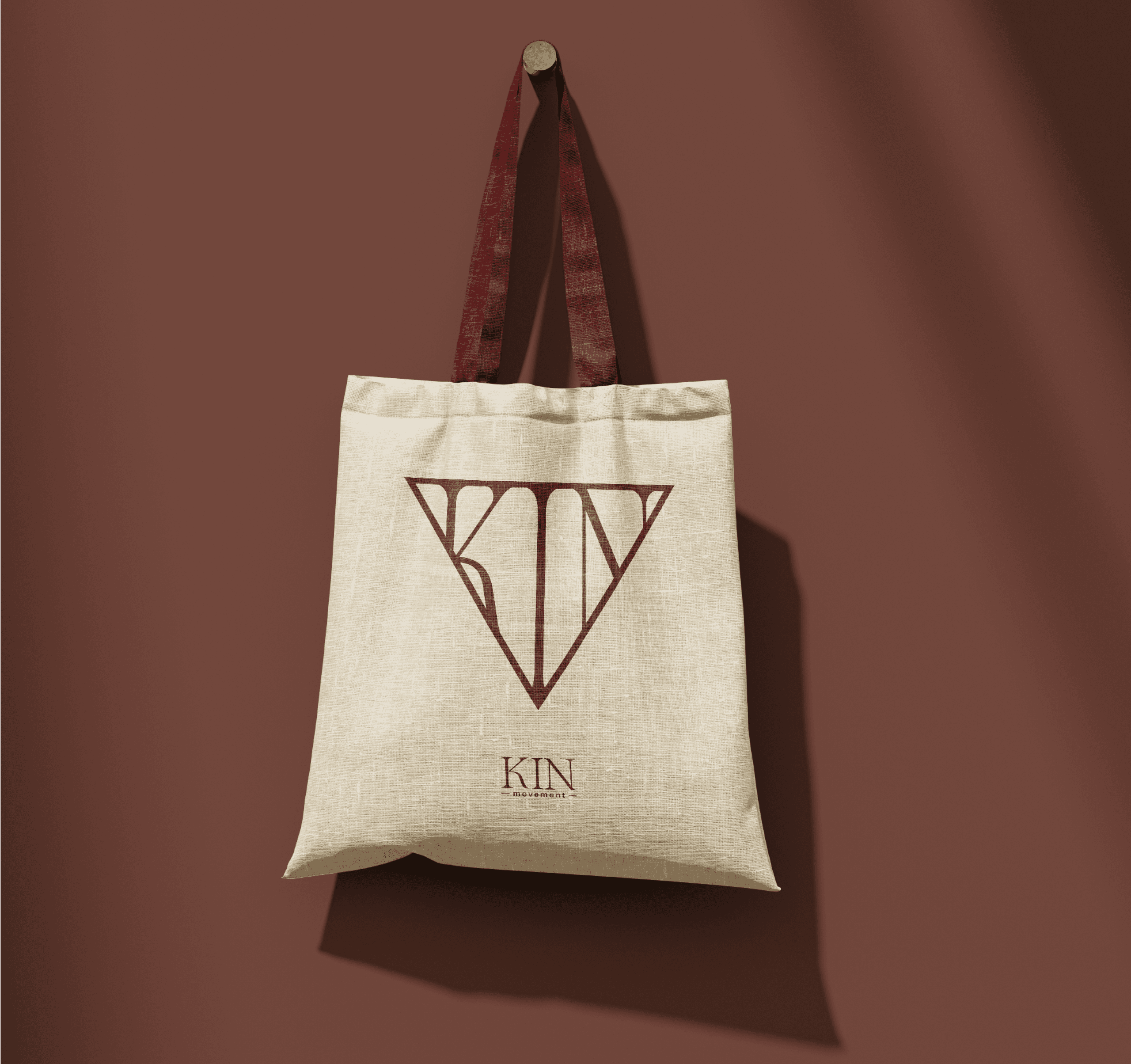
A refined wordmark that blends strength and elegance, using high-contrast typography to create a sense of balance. The simplicity allows it to feel elevated, modern, and easily recognizable across all brand touchpoints.
A refined wordmark that blends strength and elegance, using high-contrast typography to create a sense of balance. The simplicity allows it to feel elevated, modern, and easily recognizable across all brand touchpoints.
The Emblem
A more expressive mark that introduces movement and energy through form and layout. The triangular shape and curved text create a sense of flow and balance, reinforcing the brand’s focus on strength, connection, and intentional movement.
A more expressive mark that introduces movement and energy through form and layout. The triangular shape and curved text create a sense of flow and balance, reinforcing the brand’s focus on strength, connection, and intentional movement.
The Brand
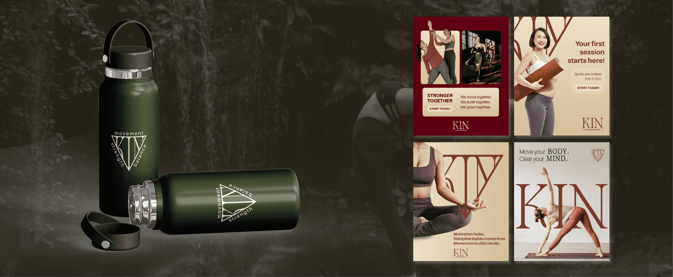
The type system blends a refined serif with a contemporary sans serif, creating a visual balance between structure and fluidity.
Inspired by the earth, the colour palette uses deep greens, warm umber tones, and soft creams to evoke calm, strength, and connection.
The Brand
The type system blends a refined serif with a contemporary sans serif, creating a visual balance between structure and fluidity.
Inspired by the earth, the colour palette uses deep greens, warm umber tones, and soft creams to evoke calm, strength, and connection.
The Emblem
A more expressive mark that introduces movement and energy through form and layout. The triangular shape and curved text create a sense of flow and balance, reinforcing the brand’s focus on strength, connection, and intentional movement.